In this blog post, we will create a menu that scales effortlessly in Figma. To accomplish this, we’ll use components, variants, and grids. It’s going to be a lot of fun!
The challenge
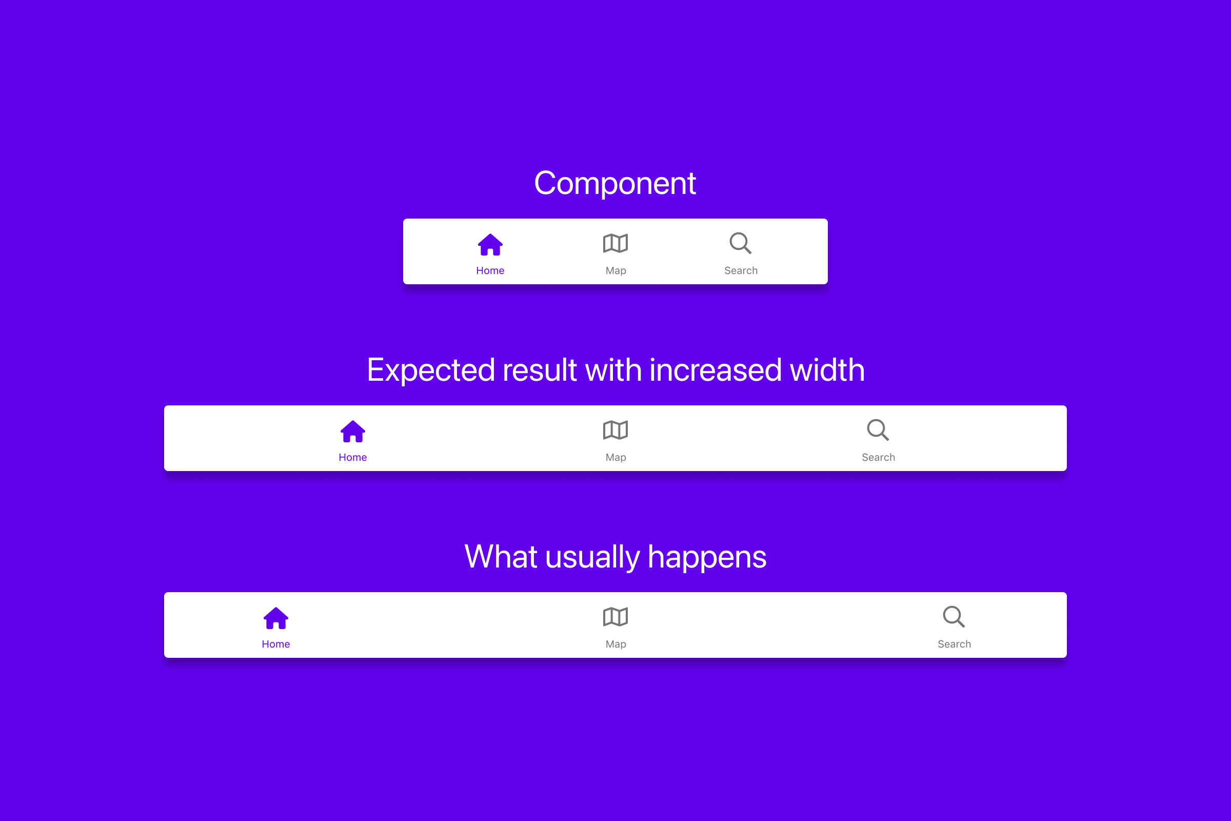
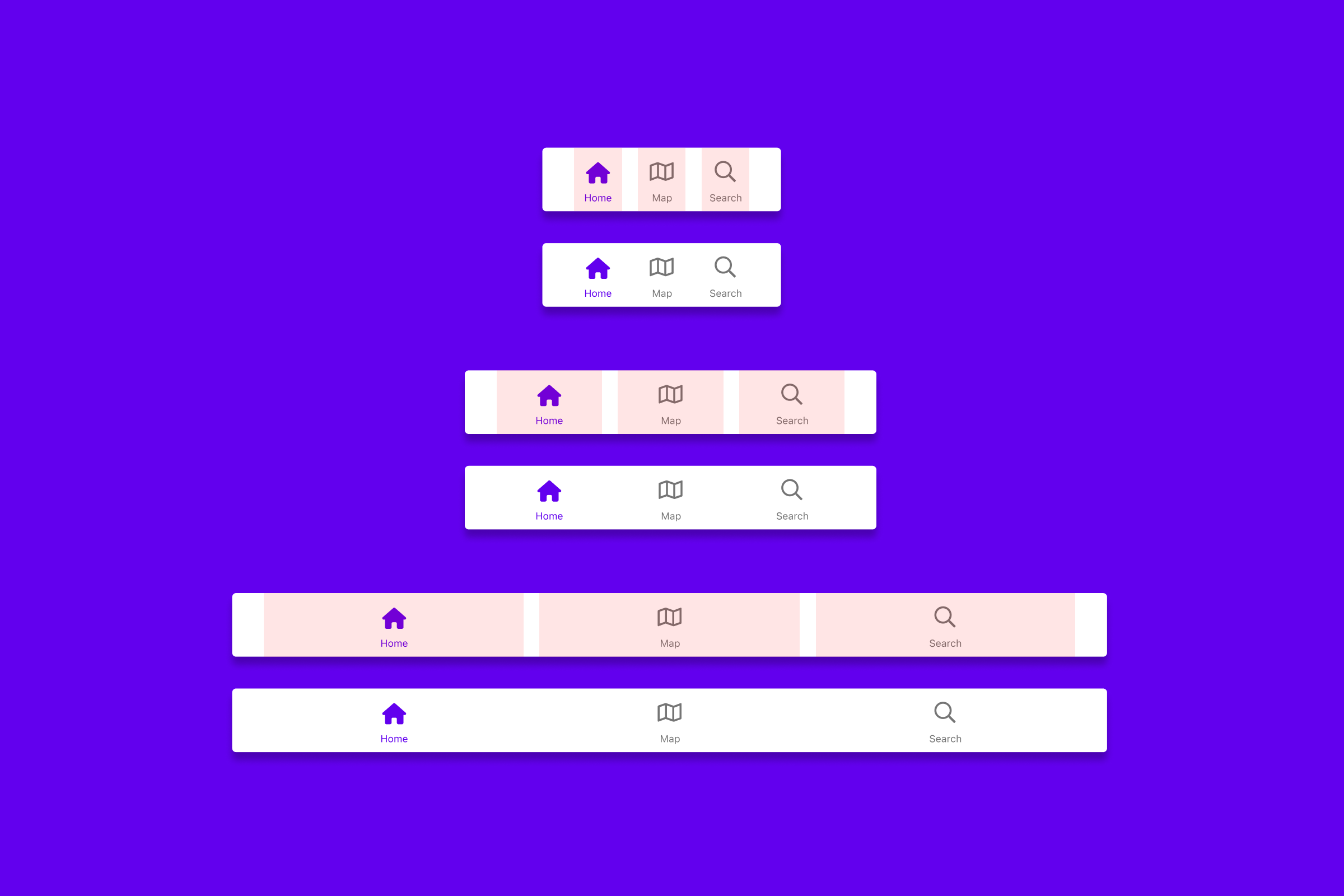
Here’s an example menu as a component in Figma with three items. Looks nice, but it turns into a mess with increased width. That’s because the containers are constrained to the sides. The expected result is a menu with a visually balanced distribution of menu items. Let’s create that!
Create the menu component
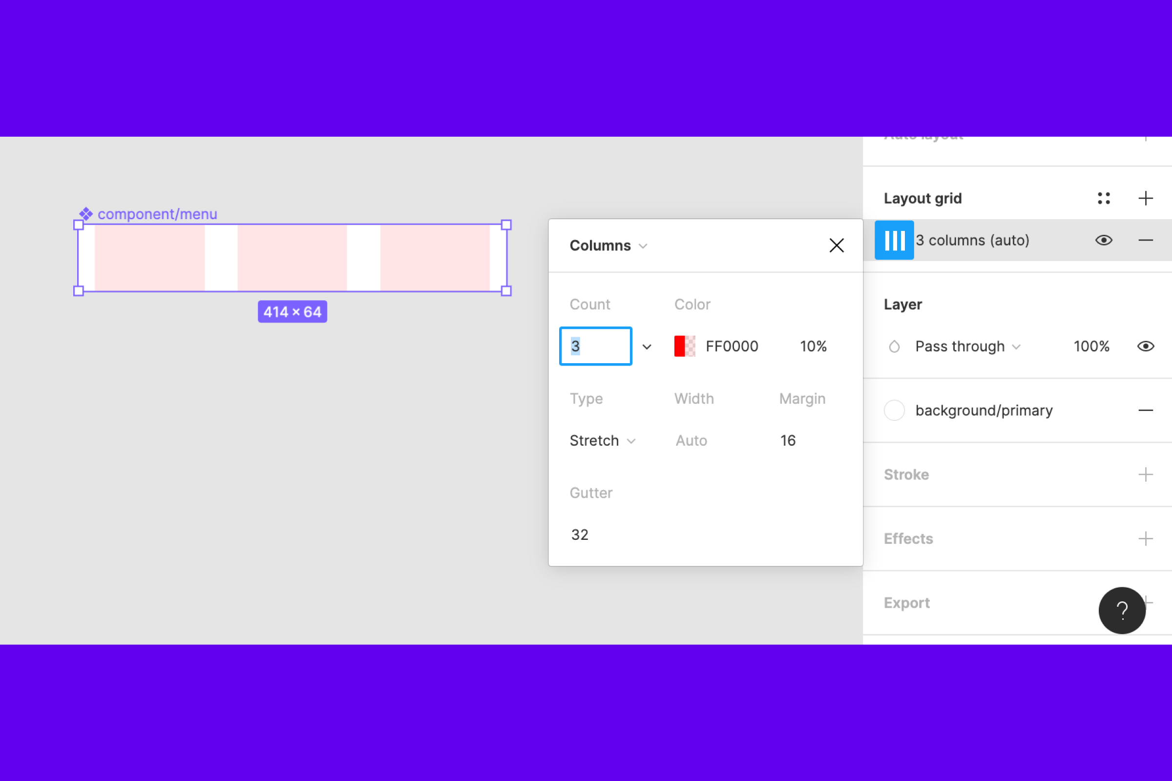
Start of by creating a component 414px wide and 64px high, name it “component/menu”. Add a layout grid with 3 columns, change to “Type: Stretch”, “Margin: 16px” and “Gutter: 32px”
Add containers
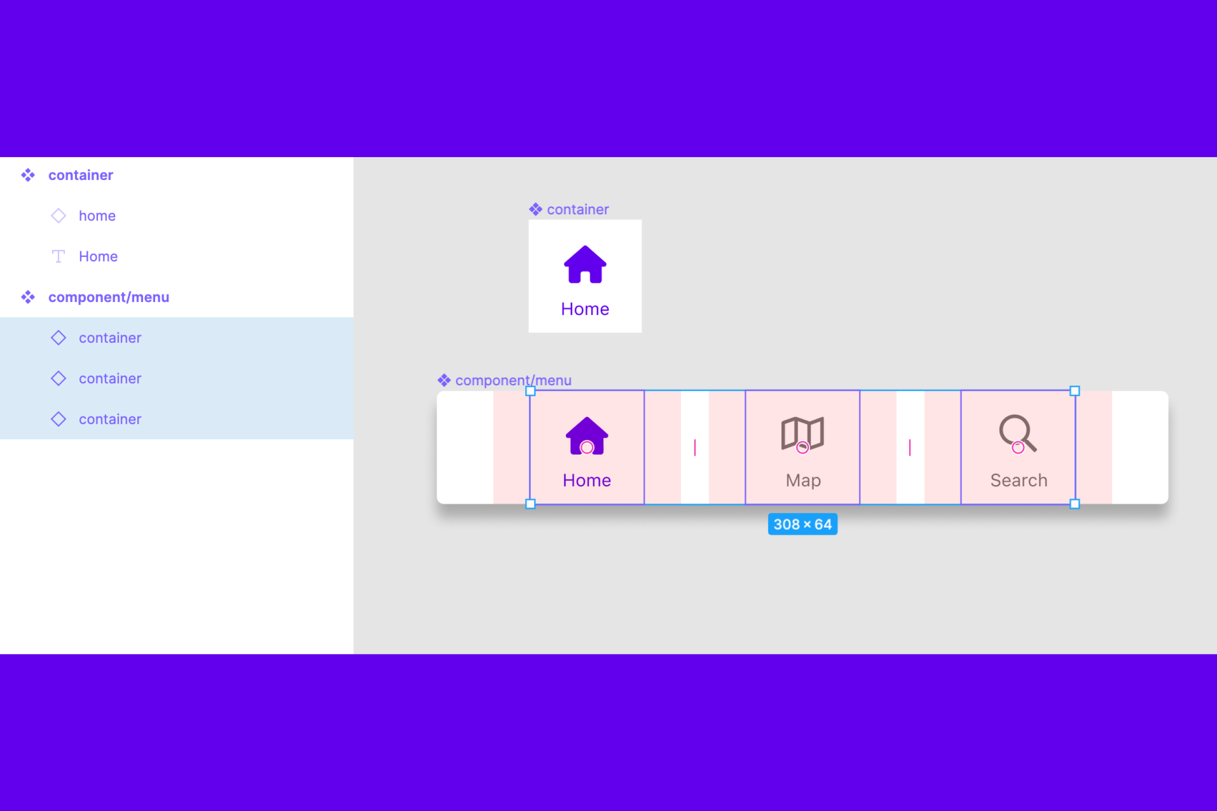
Create an component 64x64px and name it “container”. Add an icon 32x32px, constrained to the horizontal center, and place 8 px from the top. Add text in SF Pro weight regular with 10 px size, constrained to horizontal center, and placed 8 px from the bottom.\
Inside each column, place a container and make each container centered within the column.
Center the containers
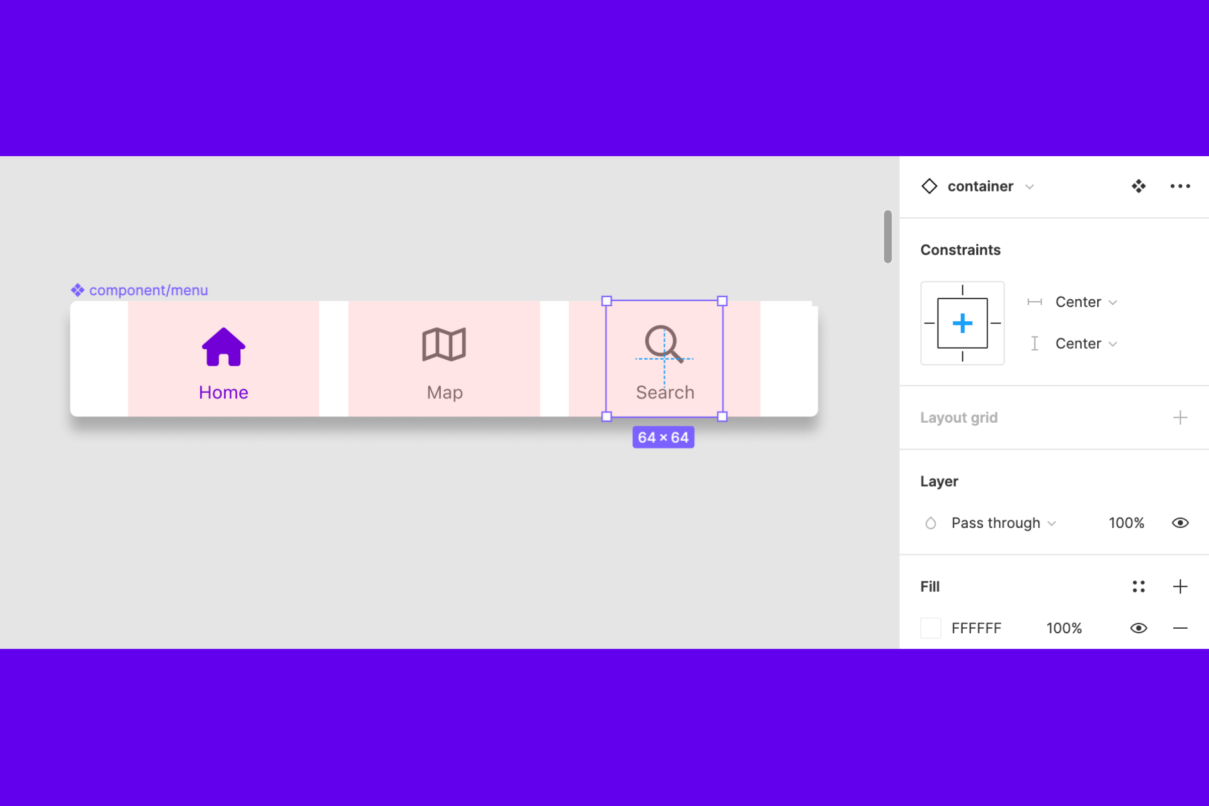
Set constraints to center for each container. That means the containers center inside its column. This step makes the menu scale smoothly, which is pretty neat!
Getting there
Looks sweet and scales without problems. The version in the middle is the one we have created. I added a smaller and bigger version to show how it scales. Now let’s use variants to make the grid adjustable for different menu sizes.
Grid in three sizes
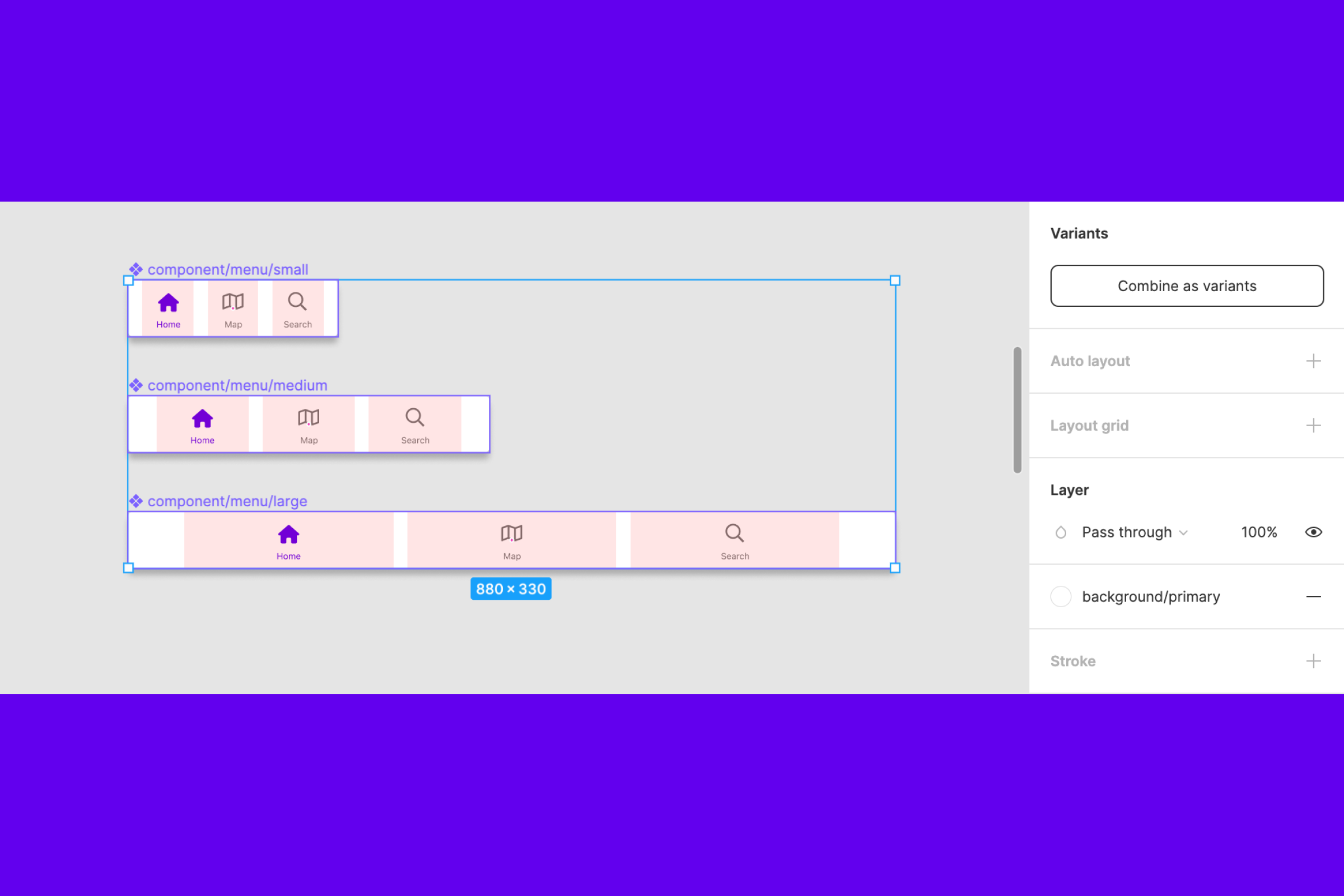
Let’s add two more components. Set the narrower one to 240px in width and change the grid to “Margin: 16px”. Set the wider one to 880px in width and “Margin: 64px”.
Then select all of the components and click “Combine as variants”.
Result with three grids
Well, well, doesn’t it look pretty? It looks even more visually balanced because we have applied different margins for each size. We kept gutter spacing the same, so there aren’t too many things happening when scaling.
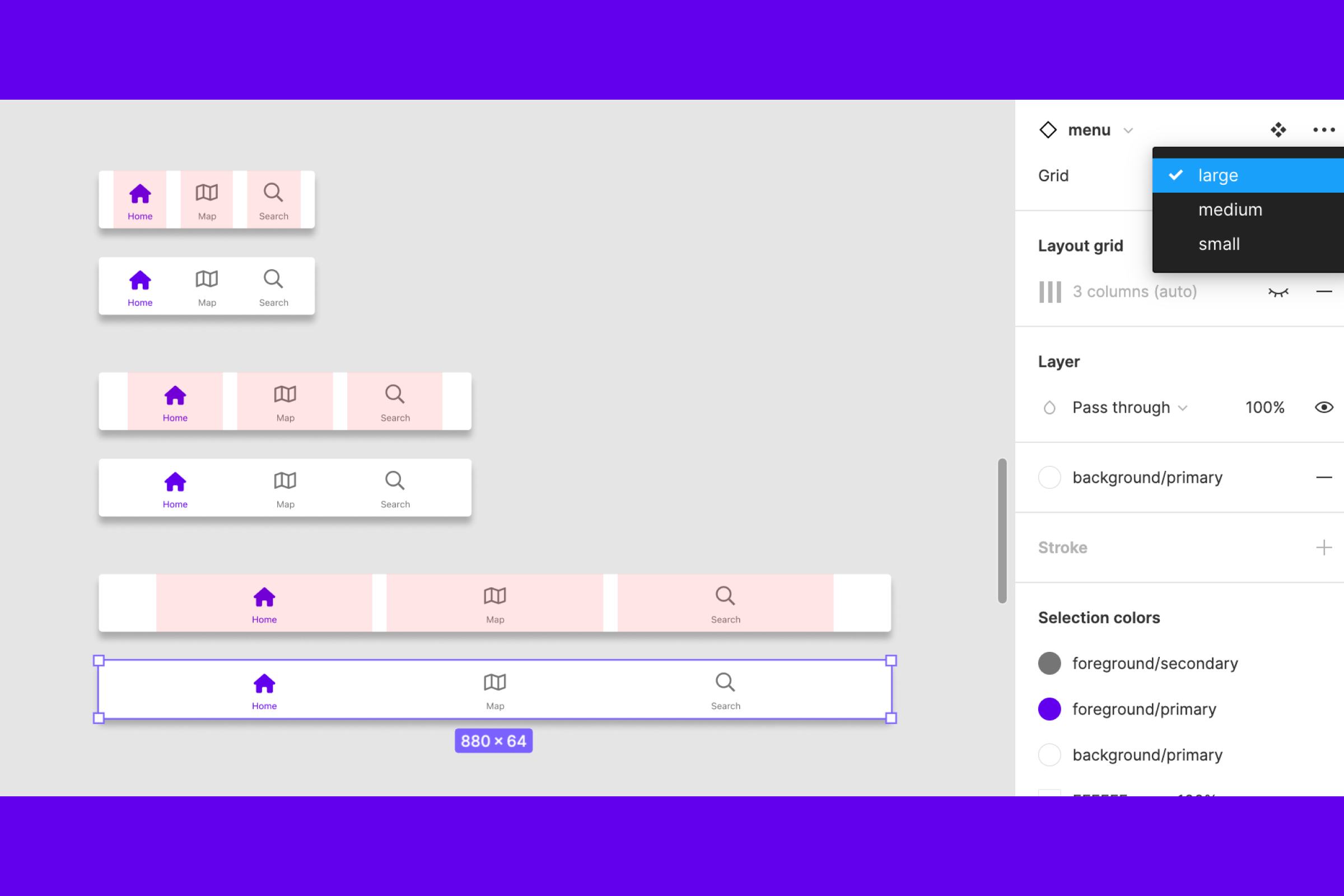
Let’s add variant for amount of containers
This next step is making our new menu even more useful.\
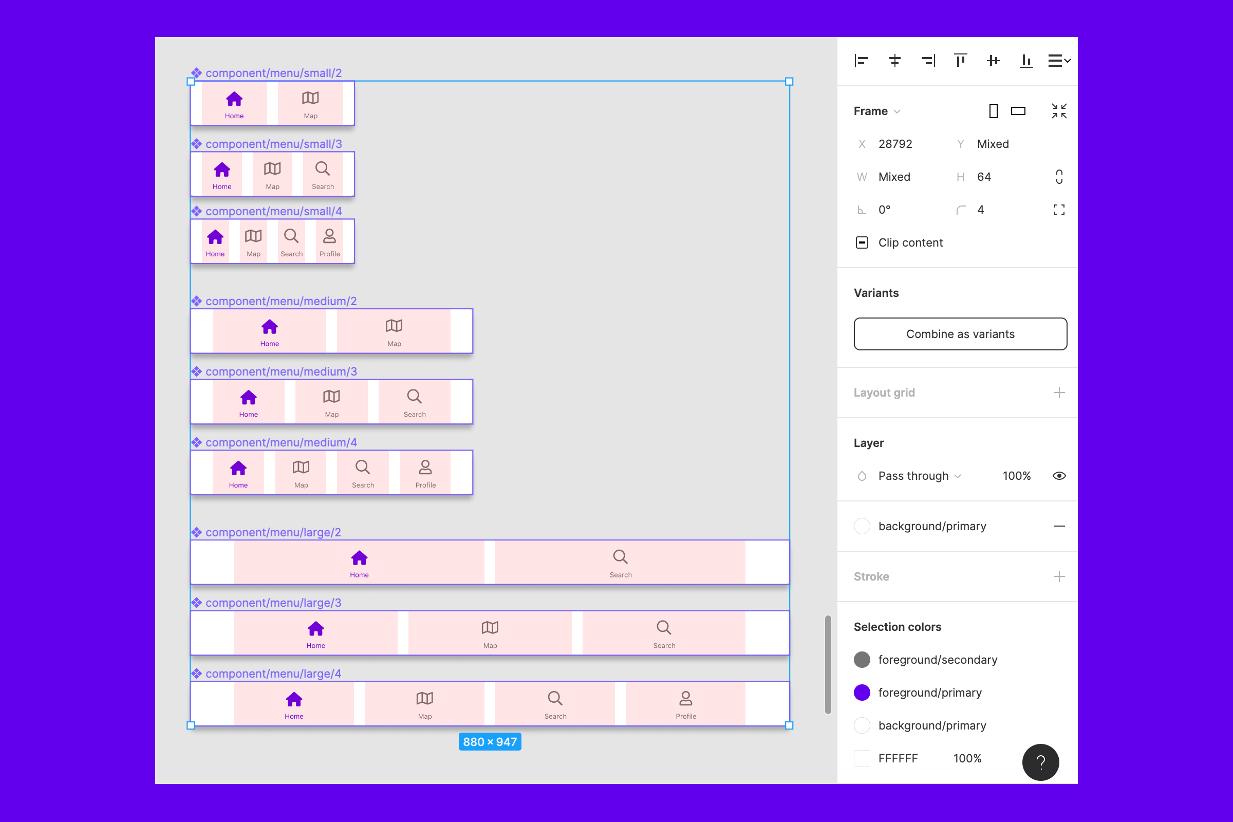
Create two more components for each menu size, one with two columns and containers and another with four columns and containers. Keep gutter and margin the same for each size of menu component.
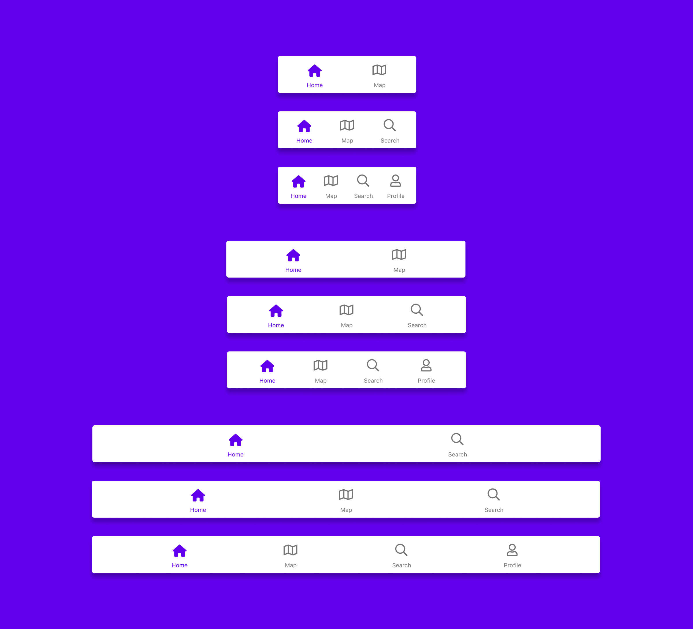
The final result
That’s a wrap! We can now use the menu in different sizes and for a different amount of menu items with variables. The different sizes are just guiding. Try and make each size narrower and wider to see how it scales.
-
I hope you had fun and found this blog post helpful!